Extempore | User onboarding experience to drive engagement
Team project, Prime Digital Academy
Extempore is a Minneapolis-based startup for foreign language education. Extempore’s flexible platform allows instructors to create speaking assignments and language testing.
Situation
Extempore’s prospective users were disengaging from the product during the free 30-day trial period.
Insight
Users did not understand their next steps to start using the platform when they first landed inside the product.
Approach
Redesign the first time site experience. Speak to teachers directly about how to use the product in their own terms.
Process
How I helped
Takeways
Baseline testing > Prototyping & Rapid Iteration > Recommendations
The team recruited foreign language teachers for baseline testing, which showed they were frustrated by the amount of information presented to them and the terminology used during onboarding and their first experience of the site. We developed a hypothesis and then tested and iterated our design.

I collaborated with the team on prototype creation, testing and iteration and also contributed:
UX writing with an emphasis on word choice and plain language
Content design recommendations: moving the ‘create class’ task from the onboarding flow to the first time site experience page, and a new content hierarchy for that page
Competitive research of similar products
An extensive content audit of Extempore’s website
This product faced a familiar challenge: how to teach users to generate their own content. This project was a great example of how easing cognitive load can lead to better product adoption.
My content audit (of Extempore’s site, not the product) surfaced many user guides and help material. These guides were not inside the product, a huge missed opportunity. I suspected teachers would love these materials, and testing showed that they did.
Placing the ‘create class’ task in the first time site experience with a clear call to action — rather than in the onboarding flow — also tested well.
Content design rationale
Before - first time site experience
No clear call to action on the page
Hierarchy and alignment do not guide the user
No further explanation on how to onboard students
Help videos aren’t accessible
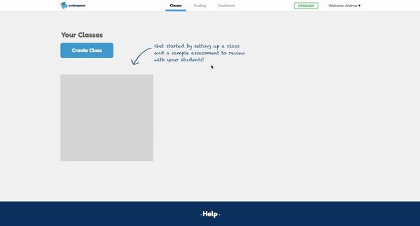
After - first time site experience
Help materials are visible and always accessible
The content is aligned and has clear hierarchy and call to action
Call to action clearly states how to onboard students to Extempore
After - task flow
Simplified approach to setting up their first class assignment
Before - task flow
Teachers found the amount of content and questions overwhelming